PRESS
Compelling Websites That Captivate Prospects

Looking Past Into the Future
It’s more important than ever in these times with limited face-to-face client interactions, that your website plays a vital role in the buyer’s journey. We recently launched a redesigned site for Heritage Architecture & Planning, a forty-year old San Diego firm.
We’ve worked for many architecture firms, yet never one that specializes in historical architecture. We discovered that their architects and historians have a very different approach to projects, something that had to be communicated through their new site. So when Brian Rickling called us, actually from his web search, asking us about our branding and web capabilities, we were delighted that our efforts to attract the right kind of client from our website, paid off.
Web Discovery: Guiding the Project
Projects begin with web discovery. We’ve learned that clients are investing a lot of time and resources for website projects, and working out the kinks at the start pays off. This step clarifies how the project will unfold. Architects do this everyday with their clients, so Heritage welcomed the time we devoted to this step.
– Define roles and responsibilities
– Establishes a timeline and milestones
– Sitemap development and approval
– User experience scheme
– Technology recommendations and decisions
– Allows us the time to get to know each other
– Determines expectations
Changes to Business Landscape
Now more than ever, having an online presence that attracts, engages and converts visitors into clients, can’t be left to luck. Technology changes daily, which impacts not only how a website functions but how users find your site and engage with it. Marketers and business development people must also adapt to shifting market conditions. The firms that are agile and evaluate how they are filling the pipeline, are those firms that will secure more work.
 Consider some of the problems that Heritage was facing and that others firms have when deciding to redesign a website.
– The visual brand is outdated and doesn’t represent the company
– No strategy for the site’s purpose
– Lack of direction for what visitors should do on the site
– Messaging does not communicate the company’s differences
– Content is dry, too verbose and boring
– No connection between the brand, design and message
– Not generating any inquires
– Not attracting the right talent to the firm
– Poor user experience
– Is not mobile compatible
– Unable or difficult to update
– No content marketing plan to increase SEO
– No site search capability
– Slow to load
Branded Story Design
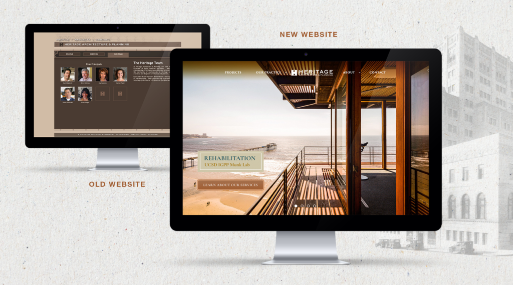
For nearly half a century, Heritage Architecture & Planning has breathed new life into many of Southern California’s most iconic buildings and places. This is the story we had to tell. The previous website left an impression of an outdated brochure, even made visitors wonder if the business was still relevant. No one was managing the site since it was difficult to update…they needed an easy solution with a content management system (CMS).
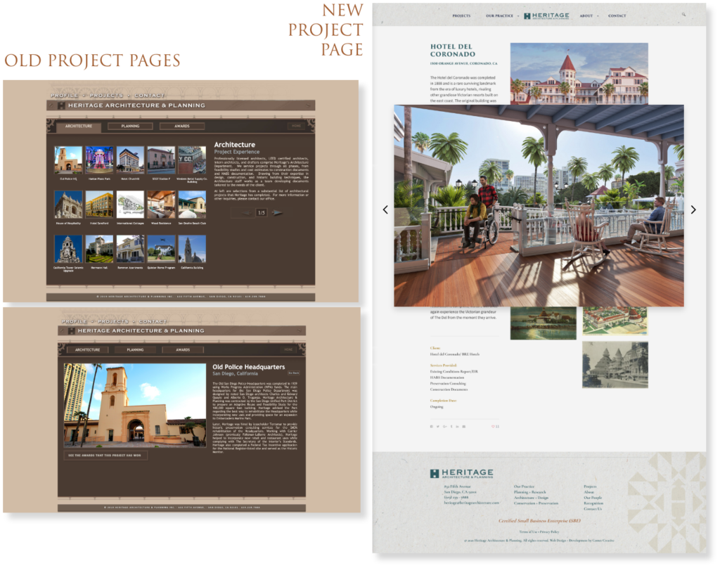
One of the biggest issues was with the project portfolio. They have a vast photography collection which was a huge plus, but it wasn’t well utilized. From the screenshots, you can see that a majestic historical building shown the size of a postage stamp, doesn’t do the project justice. Likewise, the team page, didn’t reflect the personality of the individual people and left visitors moving on.

Content Defines Differentiation
The days of a website brochure are over. Visitors are demanding that you tell them why they should work with you. Today, many relationships start with prospects checking your firm online. You have two to three minutes to get your point across…don’t waste their time by beating around the bush. Services and capabilities are why they are coming to the site, but more importantly, why they should work with you.
Heritage answered the questions in our proprietary Brand Quest.™ Their input guided us through the messaging process. Our brand strategy meetings aligned the leadership as to the site’s goal and defined their unique qualities: specialization, longevity, authority in historical preservation, project experience, unique process and awards.

EliteStart was able to help us breath new life into our very dated website. Nanette and her team are passionate and committed with what they do. They really listened and worked with us in the design process while reaffirming and strengthening our core values and enhancing our specialized traits. We are pleased with the results and only wish we came to them sooner.
Eileen Magno, M.A. Principal, Architectural Historian, Heritage Architecture & Planning
Visual Design
Much like the preservation they do, we set out to illustrate the soul of the their work — historical architecture with a modern interpretation. We developed the idea of time travel to connect the past with the present. By showing a black and white historical photo of projects, the viewer gets see into the past, with the hover function showing a color image illustrating the results of their restoration.
The page leads with a full-bleed, impactful project image slider to create an immersive experience right off the bat and really make the statement of “We preserve historic places and then make them better.”
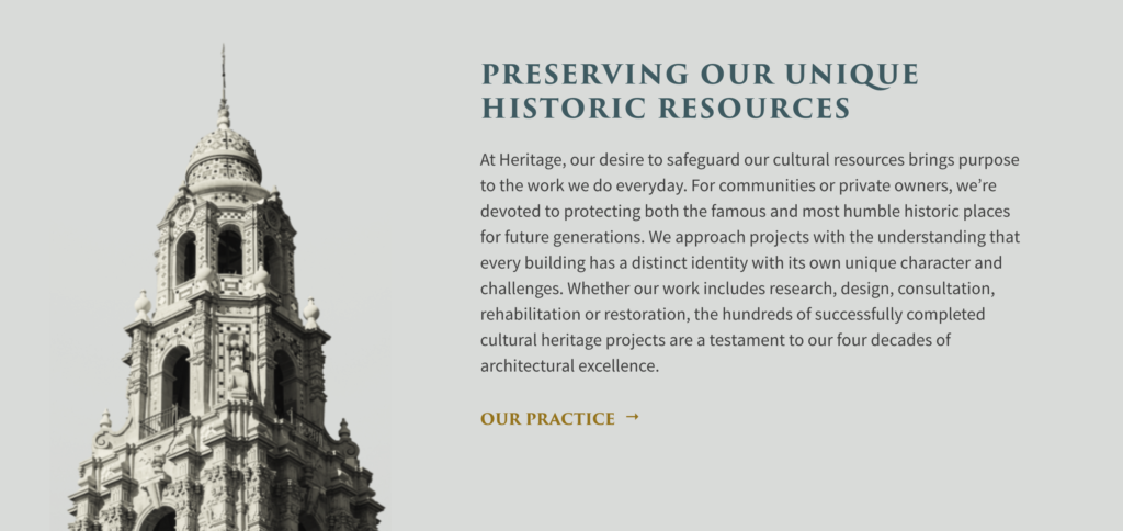
Heritage is well known for restoring highly detailed ornamentation, so we incorporated those beautiful details into the design. They create interest and add to the historical theme of the site.
Interactive elements added throughout the site emphasized our the “time travel” concept, while engaging visitors to interact with the site.
Steve Whalen, a professional photographer, joined our team to take portraits of key personnel, cultural shots, shots taken throughout their offices at the historic Yuma Building and headshots for the team. With the high quality, consistent, culture-rich photographs, the company’s culture is well presented and communicated. It brings visitors a clearer understanding of Heritage’s capabilities and an optimism that is a shared trait among its staff.

Usability
The old site wasn’t mobile responsive, users would get lost on the site and the website was slow to load. With the internet getting faster and faster, people are even less patient to stay on a site. If they can’t get what they want in a matter of seconds, they are going to bounce.
A search function was entirely missing on the old site. People had to click through all the possible paths to find what they needed, instead of simply searching for it. It was a waste of time for visitors and the staff couldn’t even use it for business development.
Now the site is fully responsive, the content and elements resize automatically to fit the user’s display, desktop, tablet or phone. The navigation is optimized to meet modern day expectations. We made sure important links are only two clicks away from what the user wants to see and we included a search function.
The projects’ area was a section we paid close attention to. Forty-years of projects are now efficiently categorized and showcased in a storytelling format. It’s highly interactive and immersive, and by clicking through different markets, projects feed correctly from the database.
The firm’s history is highlighted in an interactive timeline, to show the various milestones over the years. An interactive slider allows viewers to adjust the date range to highlight various times of the history.
While calls-to-action were subtly included on every page, the design and content doesn’t appear to focus on sales, which aligns with the personality of the company.
Filling the Pipeline
Heritage Architecture’s new site gets extremely positive feedback, but more importantly, visitors to the site are up 42% and the request for proposals are up as well. When we complete a project, we’re always encouraged by the results our clients get from our work, we’ve also learned a lot and made new friends.


